Why I use Lightroom Presets
Over the last year Lightroom has become a must use application when it comes to me editing photos in RAW. Not only does this app allow you to fine tune almost every aspect of your photos, incredibly precisely I may add, but it has the power to massively speed up your workflow.
Working smarter, not harder.
For me and my workflow there are two features I use on almost every photo shoot.
1. Sync changes across multiple photos
If you’ve shot multiple photos in one location, you may find the Sync button becomes your best friend. Simply edit the first photo in your sequence as you wish and then highlight all the other photos taken in the same location with the same or a similar white balance, ISO and colour balance and click the magic Sync button, sit back and watch Lightroom automatically correct and match all the photos for you – simple, fast and oh so easy!
Step to sync your changes
- Make all your changes to the first photo
- Select all the other photos that match this photo
- Click the Sync button
- Pat yourself on the back
2. Work with presets
The second feature I use is presets, this area of Lightroom is one of my favourites. It allows users to save a whole range of changes that have been made to your photo into a preset file. Once you’ve created your preset you can then apply this to any photo in your library with one click.
Download Free Seventy4 Presets
Below I have two free presets, all you need to do is download your copy below, open it within Lightroom and then simply select any photo from your library and click the preset of your choice in the Lightroom presets panel.
While presets are a fantastic way to speed up your workflow it’s only a starting point and some key changes will still need to be changed such as exposure, highlights and shadows and on occasion the vibrancy of your photo.
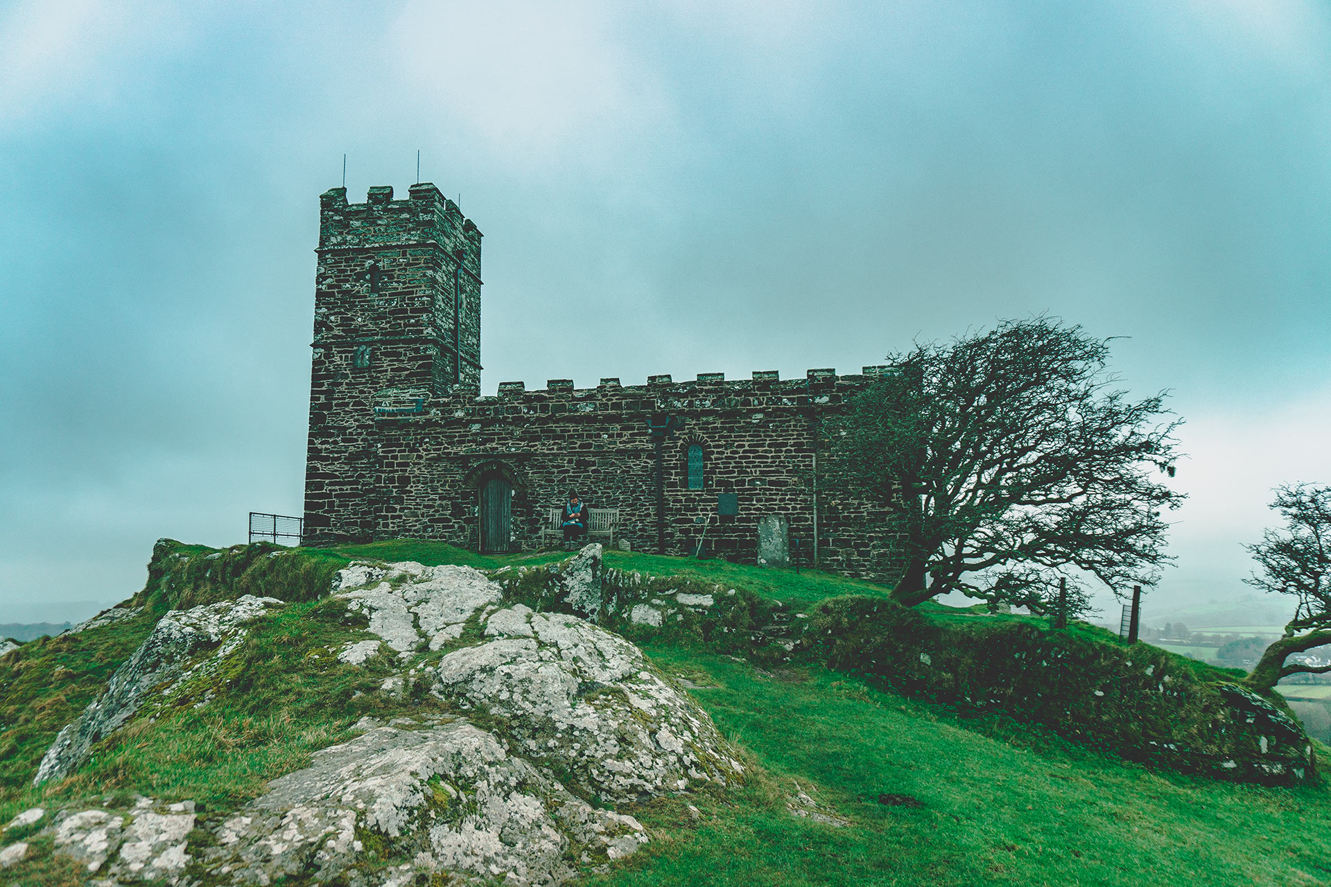
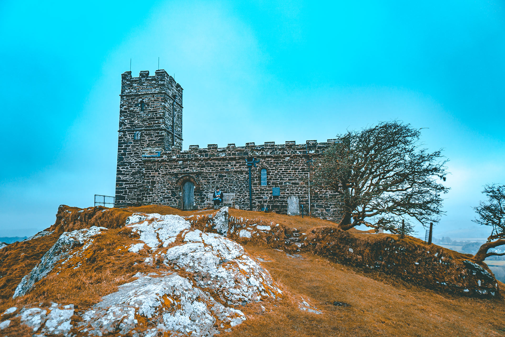
74 – Orange & Teal – Ideal for Landscapes
This preset was created to give my photos an autumnal feel by changing the greens in the landscape to an orange/yellow tone while turning blues to a teal tone – you can see an example of this in use below.
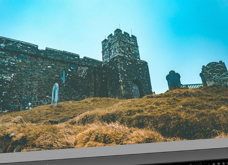
74 – Feeling Blue – Ideal for Landscapes
The Feeling Blue preset was the second I’ve created, I wanted my photography to have a feeling of a dull, damp and slightly miserable British day, something us Brits get to see fairly often.